This portal contains the core design standards, graphic assets, and identity rules for MADJAXUK.
Whether you are creating print collateral, digital media, or event signage, please ensure all assets follow these guidelines to maintain our brand integrity. Access our complete media kit below, or scroll down to view our full design specifications.
Primary logo.
The MADJAXUK logo is the foundation of our brand identity. It represents a bold approach to personal transport, combining modern design with individuality, premium styling and unmistakable presence.
Every application of the logo should reflect the personality of the brand. Clean, confident and instantly recognisable, it should always appear with clarity and consistency, whether used across digital media, print, vehicle graphics or promotional materials.
To protect the integrity of the brand, the MADJAXUK logo may only be reproduced using the approved brand colours. The logo should appear in Red, White or Black only and must never be altered, stretched or displayed in unapproved colours.
When placing the logo over photography or coloured backgrounds, always ensure there is sufficient contrast to maintain legibility. In most photographic, dark or high-contrast applications, the White version of the logo should be used for maximum impact.


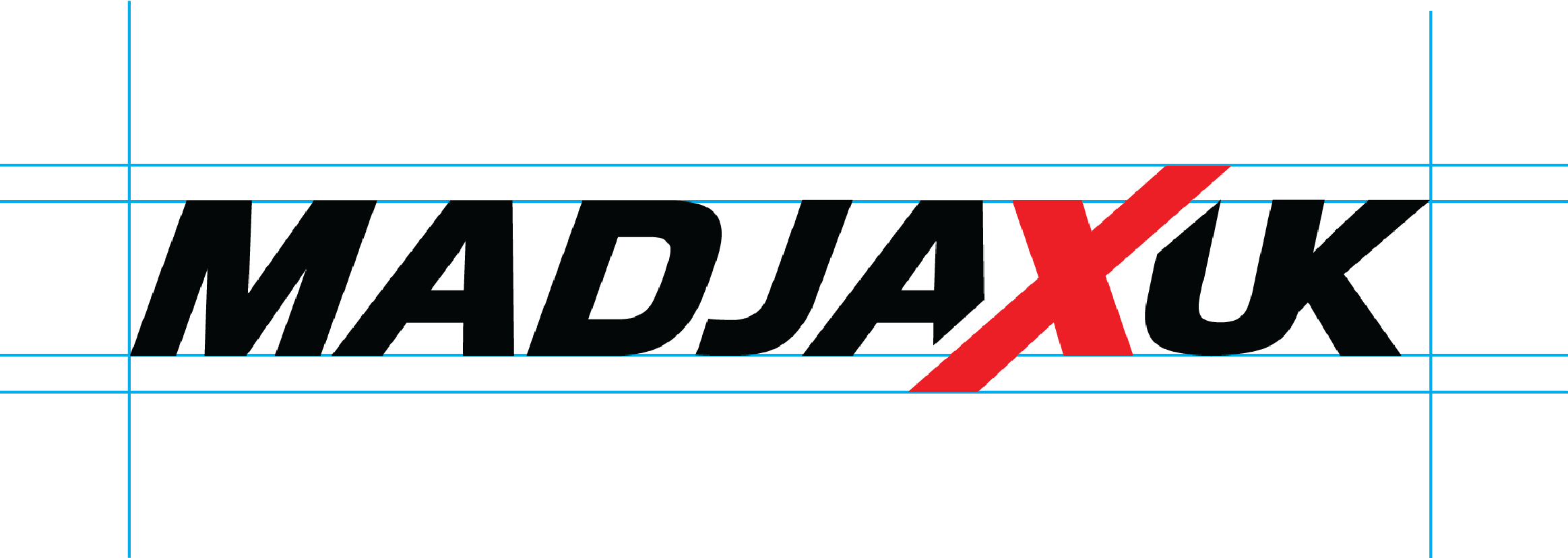
Logo clear space.
The MADJAXUK logo should always be given sufficient space to maintain visibility, legibility and impact.
The designated clear space area must remain free from other visual elements, including typography, imagery, borders, secondary logos and other graphic details. This ensures the logo remains unobstructed and instantly recognisable across all applications.
No graphic element should encroach on this boundary. In digital or small-scale applications where available space is limited, the clear space requirement may be proportionately reduced, provided the logo remains clear and legible.
Minimum logo size.
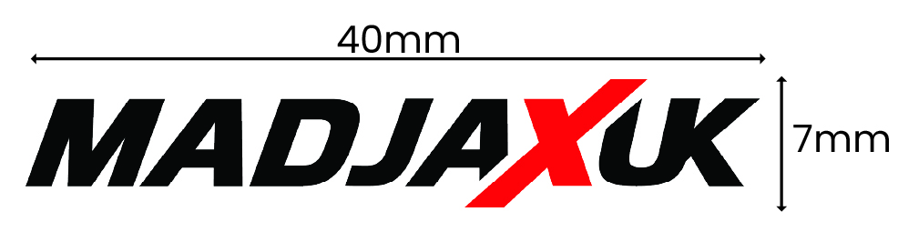
To maintain legibility and preserve the integrity of the MADJAXUK logo, it should never be reproduced below the minimum size shown.
For printed applications, the logo must not be reproduced smaller than:
Width: 40 mm
Height: 7 mm
There is no maximum reproduction size. For digital applications, the logo may be scaled larger as required, provided it remains sharp, proportionate and of sufficient resolution.
If a project requires the logo to be reproduced smaller than the minimum dimensions specified above, approval must be obtained before use to ensure the logo remains clear and recognisable.
Do not.
The MADJAXUK logo should always be used as supplied.
Avoid modifying, recreating or altering the logo in any way that compromises its integrity.






Colour palette.
Typography.
Typography plays an important role in creating the distinctive MADJAXUK look. The combination of The Seasons and Atyp BL Variable creates a balance between premium, expressive headlines and clean, modern supporting content.
Primary typeface.
The Seasons is the primary display typeface used across MADJAXUK communications.
It should be used for:
Aa Bb Cc Dd Ee Ff Gg Hh Ii Jj Kk Ll Mm Nn Oo Pp Qq Rr Ss Tt Uu Vv Ww Xx Yy Zz
0123456789
Typography hierarchy.
Headlines.
The Seasons.
MADJAXUK headlines should use sentence case to create a clean, contemporary and confident look. Avoid capitalising every word, as this can make headlines feel overly formal and less aligned with the character of the brand.
Secondary typeface.
Atyp BL Variable is the secondary typeface used to support The Seasons across MADJAXUK communications. Clean, versatile and highly legible, it provides the balance needed for supporting content without competing with the headline.
It should be used for:
Aa Bb Cc Dd Ee Ff Gg Hh Ii Jj Kk Ll Mm Nn Oo Pp Qq Rr Ss Tt Uu Vv Ww Xx Yy Zz
0123456789
Typography formatting.
Full stop usage.
All MADJAXUK titles should end with a full stop.
This applies to: